Tuesday 7 October 2008

BP


I really like what Landor did to redesign the BP brand, establishing its identity with global presence.

Thursday 28 August 2008

Typography Workshop

typeworkshop.com

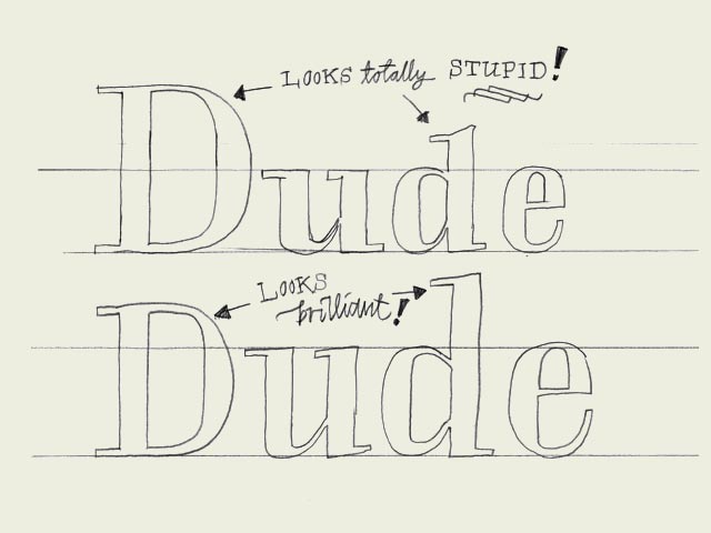
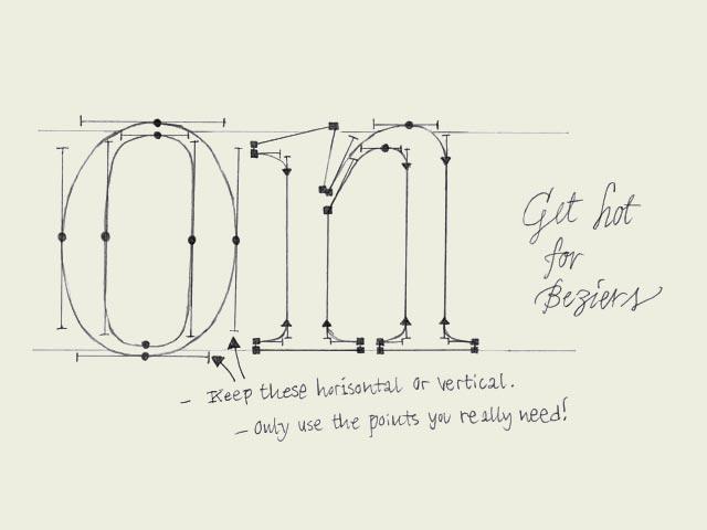
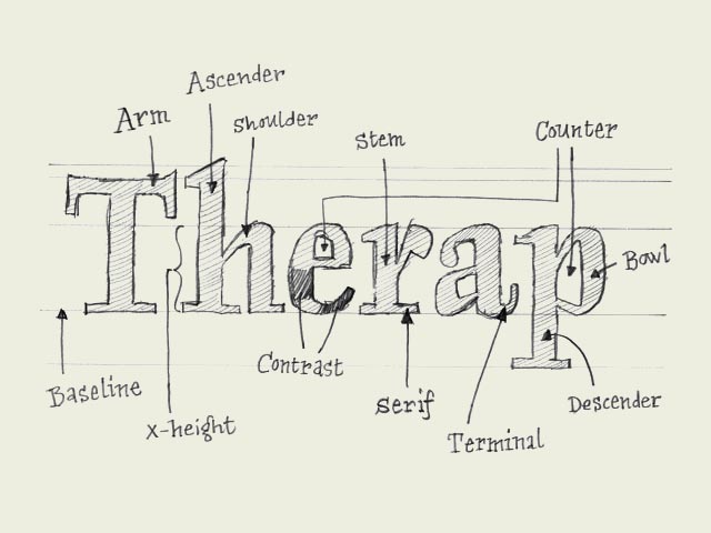
I've just found a website which deals with teaching the wonders and woe's of Type design. Here are a few sketches of whats on the website, its really good fun to look at.


Monday 25 August 2008

Update!

Its been ages since I've posted anything on this blog, I feel as though I should really have kept this going since the end of term but I've been fairly distracted by other things! So anyway, I've been learning Dreamweaver these past few weeks because a) i want to be good at it & b) I've always had an interest in web design. What baffles me about Dreamweaver is that now that its not just used as a web design tool but its kind of another InDesign, where you draw upon elements you create in Flash and Aftereffects to enhance the capabilities in Dreamweaver.

Its a great piece of software, there's so much to remember and I wouldn't have had a clue if it wasn't for this book I'm using... Dreamweaver for dummies. I'm about halfway... Hoping to have something to show when I get back in September.

also, the type museum in london is shut... this is going to cause problems for my diss research... doh!!! If anyone reading this was hoping to visit it aswell... well... you can't.

Over & Out.

Monday 7 July 2008

Agamben


A while ago Agamben was invited to teach a seminar at NYU, but then canceled because he didn't agree with the new measures of being fingerprinted when entering the United States. Biopolitical tattooing, as he calls it. He wrote an explanation of his decision in Le Monde, encouraging European colleagues to follow his example, and stayed where he was. Agamben is practicing his idea of potentiality - having the power to do, or, as in this case, very well not to do something; and while refusal can be a political act in itself it seems that here it is incomplete. For what his decision inevitably entails is that he will never lecture in the United States again.


Not only is this result in nobody's interest (except the administration's, who should be delighted that their measures work so effectively in keeping, if not alleged terrorists, then at least dissenters and critical theorists under control and out of the country), but it does little to reinstate Agamben's potentiality either. He still doesn't get to do what he initially wanted, and should, do - lecture. This, he accepts as an unappealing necessity.


The more radical move would have been to do what he did, choose not to go and make his position clear, but then find a way of by-passing those restrictions. In this case for instance quite simply instead of being physically present and having to undergo the procedures holding a video-conference lecture. That way he still has a chance to articulate his concerns but furthermore uses available means' (in this case technology's) potential to assist radical, critical, creative activity. And crucially it is precisely this form of appearance (the ghostly appearance) that can allow Agamben to make, or rather perform, his statement and politics anew every single time he becomes quasi-present in a space in the US. In the way he chose to act he only got to make it once.

Science Under Fire

Check this out from Science Under Fire,


Wouldn't that be amazing.

Antony Micallef

I'm not normally a fan of artists but these days a lot of Art seems to be design based/ lead and a lot of Design caters for the Visual Aesthetic pleasures of the human Eye.

There is a fine line separating the two, which is a god and a bad thing as I am more interested in Design work, however, Anthony Micallef has a voice, a message and a style as an artists which attracts me to his work.


Friday 4 July 2008

Matthew Hilton Logo


www.matthewhilton.com

The logo designed by Spin studios in London, is really cool. Go check it out on their website for a more contextual view of it.

Thursday 3 July 2008

Klaus Voormann

Look at this font.

Amazing.

Kenya Hara

Designer of the Matsuya Ginza Renewal.

http://www.ndc.co.jp/hara/home_e/

Really inspiring work here,

Japanese, minimalistic, classy, tasteful, graphick..y design.

I think this is really interesting stuff. Great use of layout, positioning, tone of voice from colour palettes, typefaces, print solutions... generally outstanding.

Miller Beer "Dominoes"


This is brilliant.

Wednesday 2 July 2008

Holly Wales

I saw this in an old Creative review from a few months back. It reminded me of our BA Graphics photo page of everyone and how its been doodled on over the past 2 years.

If we ever have a "Class of..." we should keep that, scan it and have it printed up for everyone to keep.

Just an idea!


Friday 27 June 2008

Timothy Helmer

http://www.smpl.be/

Another flash site, but if you check his work out you can see he did work for "Creative Network" in Belgium, something that the LCAD is involved with now. I am pretty sure its the same organisation, ish, that is involved in bringing together creative minds in cities.

Helmer predominantly uses sans serif fonts in his work, very rounded edges like a font called "ihop". It's a very modern, playful european look at the moment.

Saturday 14 June 2008

Funky Typeface

This is a promotional flyer done to promote a gig in which my old band (this city) are playing at later this month. I just wanted to comment on the type, which is seemingly hand rendered and uses no obvious details to define the letters. They are essentially just outlines which I think is pretty cool. Also all upper case to make it easier.


Thursday 5 June 2008

Experimental Jetset

Experimental Jetset come up with some really interesting type solutions, I think aesthetically they are visually pleasing and the solutions fulfill the brief criteria that you can read about on their website www.experimentaljetset.nl.


PPD Evaluation


PPD Evaluation

Ken Wong

The second year has been an invaluable learning experience, the course covered many important and key fundamental skills required in the field of Graphic Design. We began by understanding and appreciating print processes through the first module, it seemed as though it was part of our jobs as designers to look after the interests of our printers and clients, when dealing with print based jobs. We then moved onto Digital media, where we explored animation and DVD authoring which was a completely different learning experience through technology than we had done before. Along the way we have had our design practice 2 module which included D&AD and Type Sessions that were also invaluable, as well as other smaller modules.

There has been a considerable difference in personal demand in the second year; mainly on self-organisation and realisation of ones place in the graphic design industry. There has been a lot of pressure however the organisation skills that were learnt within the first year prepared us for the second year which ultimately pushes one to become a professional as opposed to a student. I knew I had a strong interest in typography and layout before I had began the course, however, I am now aware that that field is very diverse and perhaps (for now) I fall into a more corporate designer category. This is something that I am happy about, as I also have a st¬¬rong interest in avant-garde use of typography, therefore my understanding of the basic principles is required in order to understand how to break principles.

It is odd how yellow Post-it notes have become the backbone in my design practice, as I am heavily reliant on jotting reminders and ideas onto them constantly as a way of organising myself. I also use a diary which is adorned by yellow paper notes, which helps me organise my time and schedule for the course.

This year I have learnt a lot, respecting the conventions of typography and layout, grid systems, how to set up a basic website using Dreamweaver, how to design and authorize a DVD menu using After Effects, specifying documents for printers and animation using Flash. All of which I wanted to learn and came on the course knowing that I would be given the opportunity to do so. One key learning curve that I am really glad to have already experienced has been working on live briefs for clients. Producing work as part of the course operates differently from designing for a paying customer, the way in which the body of work that develops is slightly different as you take into consideration your interactions with the client and work in a way that keeps them happy. This is something that I really enjoyed and hope to gain a lot more experience, in the final year of the course.

There have a few occasions where I have slipped up and made bad decisions, or lack of decisions. Firstly being my negotiation of the design identity brief which I felt I should have been more decisive earlier on, however I also think I chose something that has been really useful and practical for me in the future, as I learnt a lot about publication layouts and am now beginning to feel competent when identifying grid systems. Another occasion was designing my DVD menu, looking back in retrospect I feel I didn’t convey my voice as a designer very well and worried too much about the technical side of the project.

On the positive side of things, I think my strengths rely on my ideas and concepts and working along them. My understanding of Graphic Design has been that we are “problem solvers” and I feel that I am playing that role out fairly confidently in regards to the D&AD project, print processes and 203 Brief solutions. Over the summer I am set to gain valuable work experience, and hope to maintain my momentum by working on live briefs/ projects in preparation for the third year; this will be important, as no doubt it will be a very demanding stage ahead. Upon returning for the final year, I hope to learn more about digital production such as website design and other on-screen based production as this is something I really wish to build upon.


Sunday 1 June 2008

Type is sexy .com

Typeissexy.com

"Principles of Typographic Design"


A great website which is extremely informative about typography, its pretty bite-size and doesn't go into much detail but is extremely useful. I think by visitng the website a handful of times, you would be able to remember pretty much all the information on it.

Wednesday 28 May 2008

Orange - Romania

This is Wieden & Kennedy's campaign for Orange Mobile in Romania. Its very simple and utlises some really interesting photography. I like the tone of the photography, it is very much less saturated so that the orange stands out more. Again, Orange are using Helvetica Light (or a similar typeface) in their design which always looks comfortable.


Friday 23 May 2008

Nike Ad...


I'm sure this is the talk of the town.

Guy Richie directed, every school boy's day dream has come true in the form of a Nike ad. I saw this during the half time break between liverpool and chelsea during the Champions league semi's 08. I think it was the first time it was aired on television, absolutely blew my mind. Perfect advert for football!!! Thumbs up.

Tuesday 20 May 2008

Sebastian Lemm

Type installation by Sebastian Lemm

Interesting use of type, using photography and creating a 3D installation. Rarely do you see type installations, I really like the choice of a sans serif and the style of photography. Its kind of creepy yet attractive.


Sunday 18 May 2008

Black Sabbath


Youworkforthem.com

Designed this wicked typeface, possibly the thickest Serif font I have ever seen. The kerning is minimal, each letter takes up so much space, there is practically no space between them which makes them look so squashed, yet comfortable. It is definately a display font, therefore not used for anything other than titling, certainly not for body copy. I can see it being used for promotion work, and is readily purchasable via the website (where you can also purchase a range of printed goods and typeface's amongst other things).

grafik magazine

grafik magazine.co.uk

for as long as i've been at LCAD, ive visited the Grafik website and its been almost 2 years now and they're still quoting that a new website is "coming soon"... however I still like the static logo they have.


Nice type.

Matthew Carter

Type Designer

Responsible for Verdana and the making of Arial for Microsoft (The poor-mans Helvetica).

 The most important type designer living today... still living today, i think.


Saturday 17 May 2008

Neubau Berlin

Check out Neubau Berlin.com

They've just released a new fontface, but more admirably the website is awesome. I can't post anything on buzzit or put any images on here because it is flash based. but the layout, the use of colours, the grid is awesome. 

Friday 16 May 2008

My D&AD entry


This is Matty & my D&AD design entry for 2008, Burst Sanitary Protection brief. The brief required a packaging design for women's sanitary hygiene products which could be purchased by men. We decided to target the minoritymale audience as we knew the competition to deal with sanitary protection for women would be extremely difficult and us being men, we had very little knowledge or experience when engaging with womens sanitary protection.

We chose to go for a strong concept, in hope that that would be enough to catch the judges attention. Our packaging proposed to include all types of sanitary protection for women, literally every type of tampon/ towel size possible, to suit the needs of the female that the man would be purchasing for. He would literaly have the simple task of whisking through the isle, grabbing the manly looking box and then having to casually stroll up to the nearest pay point.

We find out the results in June. Fingers X'd.

Wednesday 14 May 2008

Felici Varini


I'm sure everyone is talking about this, being that its been in Creative review but I think its genius. An artist with a graphic touch (well, the weight of line seems graphic to me!) his work can only be seen from one focal point, from any other it just seems like a mess. I think the idea of having something only being visible from one focal point can be useful for a design solution in the future... we'll see.


Sunday 11 May 2008

Matsuya Ginza Renewal

Japanese Ad Agency, MGR have a really nice style when it comes to type and layout. I really like their clean cut, non gender specific, modernist, minimlaist approach to design solutions. It's very Japanese, very modern and because I can't read Japanese, the characters look more like graphic pieces to me. Which in turn is really interesting as I am aware that Japan also think of Western language as being very Graphic looking.


Monday 5 May 2008

Siggi Oddsson - Sysselmannen


Siggi Oddsson has some very interesting type solutions, I really favor his style, its fresh, contemporary and interesting. He seems to enjoy designing type which would be used for the top level of hierarchy as opposed to body copy font. Truly ambitious and inventive.