Tuesday, 25 December 2007
The Glue Society
So I stumbled upon some work by the Glue Society from australia. They recently won an award for their work called "The bible according to google earth". I'm really keen on this project and I think it works really well, as it takes on the basic principles of 2 mediums/ideas and combines them, which is essentially how funny situations are described. A bad example, such as, a reindeer in the sahara dessert, would be funny... (to some people).
Anyway, what the glue society have done is used google earth's medium of birds eye photography, and recreated some key-scenes/ story's taken from the Bible.
Adam & Eve.

Moses parting the sea.

Those are 2 of the 4 that the firm came up with. Its so simple but so effective. I guess we all have an idea or our own, a personalised picture of how things would have looked. Our own, personalised image of Adam & Eve, the only people on earth, covered up only with leaves. And when we're given what we could possibly believe to be real, a real photograph from google earth. A photograph that... is as real as it could get??? hah, fantastic!!!
Check out the Glue society's website too, its wicked. Everything is of an extreme scale on that website. Everything's so bright and playful. You feel like a child in a playground again.
Anyway, what the glue society have done is used google earth's medium of birds eye photography, and recreated some key-scenes/ story's taken from the Bible.
Adam & Eve.

Moses parting the sea.

Those are 2 of the 4 that the firm came up with. Its so simple but so effective. I guess we all have an idea or our own, a personalised picture of how things would have looked. Our own, personalised image of Adam & Eve, the only people on earth, covered up only with leaves. And when we're given what we could possibly believe to be real, a real photograph from google earth. A photograph that... is as real as it could get??? hah, fantastic!!!
Check out the Glue society's website too, its wicked. Everything is of an extreme scale on that website. Everything's so bright and playful. You feel like a child in a playground again.
Saturday, 22 December 2007
Linas Garsys
http://www.linasgarsys.com/home
Right, so I know I probably shouldn't be uploading this onto my blog but I feel I had to. This illustrator, Linas Garsys is responsible for the artwork of one my favorite bands of all time (American Nightmare/Give Up The Ghost). He worked closely with the band, doing illustrations etc for merchandise, album art... before the band split up in 2004. Anyway, he's now doing some work for another band called Hope Conspiracy and I love them as well. I'm just so glad I found out who this guy is. Even though my specialization and key-interests do not lye in illustrative work. This guy is a legend to the Hardcore Scene.
He doesn't just do hardcore-esque illustrations, there is a lot of digitalised vector work in his portfolio too.
anyway.
Thursday, 13 December 2007
Bhatoptics
myspace.com/bhatoptics


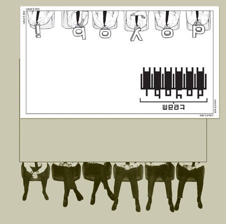
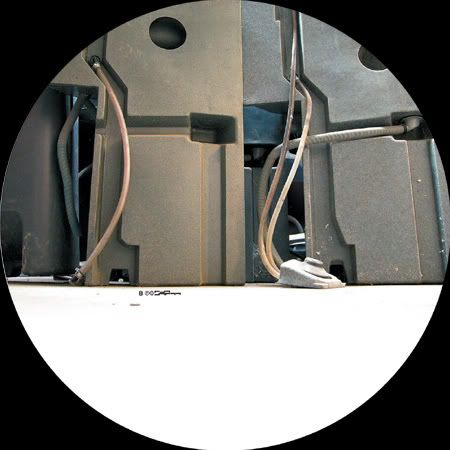
This is the work of Bhatoptics, they produce merchandising and graphic products.
They incorporate interesting us eof typographic layout and really good photography into their work. This is really inspiring, it has a very european feel to it. It has a very digital quality to it, and makes use of ordinary objects which we may take for granted. They have an ongoing theme of metalics, perhaps this is just due to their style or photostock.
Subscribe to:
Posts (Atom)